Overview
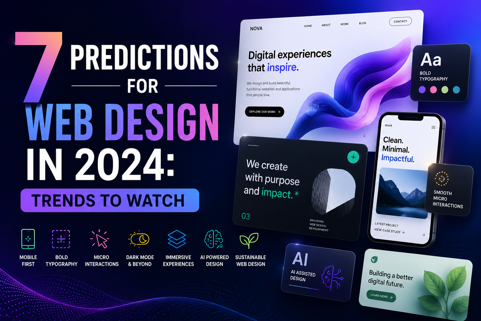
What 7 Predictions For Web Design In 2024 Mean for Modern Sites
Prediction 2: mobile design will keep dictating the whole layout, not just the small-screen version. Designers used to adapt desktop screens down to phones. That feels backward now. On real projects, the phone version is the draft, and desktop is the expansion pack. Honestly, that's healthier. More thumb-friendly buttons. Less hover-only nonsense. Better spacing. If your site feels awkward on a 6-inch screen, you've already lost half the battle.
Prediction 3: accessibility is moving from checklist to culture. And about time. Color contrast, keyboard navigation, captions, focus states, these aren't special requests. They're basics. World Wide Web Consortium standards keep getting cited for a reason, and users feel the difference immediately. What I've noticed is that accessible sites often look cleaner too. There's a practical beauty in that. One client once complained that bigger text would "ruin the design." We tested it. The readable version won by a mile. Who was surprised?
Prediction 4: motion will become smarter, not louder. Animations aren't going away. But the days of endless spin, bounce, and parallax theatrics are fading. Users want guidance, not a screensaver. A tiny fade can clarify a step. A soft transition can make checkout feel calmer. Yet a flashy sequence can also burn seconds and patience. And patience is expensive. On a content-heavy landing page, subtle motion usually beats showboating.
Prediction 5: AI-assisted workflows will be everywhere, but the best teams will treat them like interns, not bosses. Draft copy, layout ideas, image testing, small code fixes, yes, all useful. But the human eye still catches the sloppy edges. In my experience, the strongest sites come from people who use OpenAI or similar tools to speed up the boring parts, then edit ruthlessly. That's the trick. Fast first draft. Slow final judgment. The new advantage isn't automation alone. It's taste at speed.
Prediction 6: trust signals will become more visible and more specific. People are skeptical. They should be. So sites will lean harder on customer reviews, shipping details, pricing clarity, security cues, and real photos instead of stock fluff. social proof isn't new, but it's getting tighter and more honest. A vague “trusted by thousands” line feels weak now. A named client, a date, a number, a real screenshot, much better. Wouldn't you trust a site more if it stopped talking like a brochure?
Prediction 7: content and design will blend more tightly. The old split between “the designer's job” and “the writer's job” is getting messier, in a good way. Headings, microcopy, error messages, and calls to action now shape the experience as much as color palettes do. And smart teams are noticing. When the words are clear, the interface feels faster. When the interface is calm, the words land harder. That's not theory. That's what users feel.
A contrarian thought: not every trend deserves adoption. Some 2024 trends will be noise dressed up as progress. Fancy gradients won't fix a confusing menu. AI won't rescue a weak offer. And a beautiful site with slow load times still feels broken. So the real prediction is simpler than it sounds, web design will reward restraint, clarity, and honest usefulness. That's the pattern worth watching.
✅ Advantages
The upside of these 7 Predictions For Web Design In 2024 is pretty obvious once you see them in action. Cleaner layouts reduce friction. Better accessibility opens the door to more users. Faster mobile design helps with both rankings and patience, which is a rare win-win. And smarter content cuts down on support emails. What I've noticed is that teams also move faster when they stop arguing about decorative clutter. The work gets sharper. The site feels calmer. Users notice, even if they can't explain why.
⚠️ Disadvantages
There's a catch, of course. Chasing every trend can turn a site into a patchwork. One week it's AI copy, the next it's oversized typography, then it's a new animation system nobody asked for. And that mess costs time. In my experience, the biggest downside is false confidence. A site can look modern and still fail at basics like load speed, navigation, or accessibility. Another problem: trend-driven redesigns often ignore the actual audience. What looks fresh to the team may feel confusing to customers. That's a rough trade.
How to Get Started
Frequently Asked Questions
Q: Do I need a full redesign? A: Not always. In my experience, fixing navigation, speed, and content often beats a total rebuild.
Q: Is AI replacing designers? A: Not really. It's speeding up rough work. Taste, judgment, and strategy still matter.
Q: What's the most important trend? A: Probably accessibility. It affects real people, and it improves the whole site.
Q: Should I follow every trend? A: Frankly, no. Pick the ones that help your users and ignore the rest.