Overview
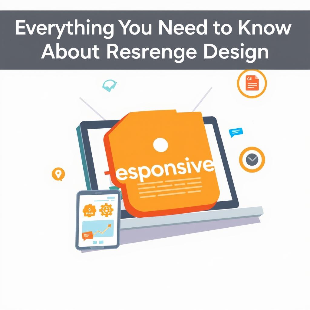
Responsive Logo Design in Practice: Sizes, Styles, and Smart Choices
The first lesson is simple: detail has a cost. Thin lines, tiny taglines, and busy crests fall apart fast on a phone. I’ve seen a café logo look elegant on a menu, then turn into a gray blob on Instagram. Brutal. So the smaller the use case, the simpler the mark should be. Apple gets this right with a clean shape that still reads instantly, even when space is tight.
But don’t mistake simplicity for blandness. A strong responsive system keeps the same personality while stripping out extras. Think of it like a band playing an acoustic version of the same song. The melody stays. The drums change. In branding terms, the color, proportions, and icon shape still feel related, even when the wordmark disappears. That’s where visual identity work gets smart instead of messy.
A solid process starts with a hierarchy. What must always stay visible? Usually the symbol, a core letterform, or the name itself. What can vanish first? Often the tagline, then extra graphic flourishes, then fine detail. What I’ve noticed is that teams who rank these pieces early save hours later. No last-minute panic. No awkward resizing at midnight.
Responsive logo design also lives or dies by testing. Don’t just zoom out in a design file and call it done. Put the logo on a browser tab, a phone home screen, a social profile, and a dark background. Print it small too. A logo that survives those tiny, annoying surfaces is doing its job. Adobe tools help, sure, but the real test is whether a normal person can spot it in two seconds.
Typography matters more than people think. A custom wordmark may look gorgeous in a pitch deck, then collapse at favicon size because the letters crowd each other. So designers often make a small-size wordmark with wider spacing or fewer details. Frankly, that’s not cheating. It’s craftsmanship. The same applies to icons with inner cuts or sharp corners. If those shapes disappear, simplify them.
And there’s a business side here too. A responsive logo makes a brand feel prepared, which people read as trust. A startup that uses one clunky logo everywhere can look smaller and less careful than it really is. That’s unfair, maybe, but branding is full of unfair shortcuts. First impressions don’t ask permission.
Color is helpful, but it can’t carry weak structure. A logo should still work in one color, black and white, or on noisy backgrounds. If the identity only lives through one exact shade of blue, you’ve built a costume, not a logo system. In my experience, the strongest marks survive when the color is stripped away. Harsh test. Worth doing.
Keep file organization clean too. Name versions clearly, like full, stacked, icon, and mono. Export the right sizes for web and app use. Then hand the system to anyone who’ll touch it, from marketers to developers. If they can’t use it without guessing, it’s not responsive enough. brand guidelines make this part less painful.
A good responsive logo doesn’t try to impress everyone at once. It stays recognizable across contexts, stays readable at small sizes, and stays consistent across channels. That’s the game. And honestly, if your logo can do all that, you’re ahead of a lot of bigger brands that still haven’t fixed the tiny version on their site.
✅ Advantages
Responsive logo design gives brands cleaner recognition on every screen. A small icon can stay sharp on a phone, while a full version still looks polished on a homepage. That consistency builds trust fast.
It also makes teams more efficient. Designers aren’t forced to cram one oversized logo into every format, and developers get assets that fit real use cases. Honestly, that saves a lot of back-and-forth.
And there’s a brand memory benefit. When people see the same core shape, color, or letterform across social media and product screens, they remember it faster. In my experience, that tiny repetition matters more than flashy detail.
⚠️ Disadvantages
Responsive logo systems take more planning than a single fixed logo. You’re creating several versions, not one file, so the upfront work is heavier. Small teams sometimes hate that extra setup.
But there’s also a risk of over-simplifying. If you strip too much detail, the logo can lose personality and start looking generic. That’s a real problem. A plain circle and a letter can work, sure, but only if the rest of the brand identity carries enough character.
And if the system isn’t documented well, people misuse it. One team member grabs the wrong version, another stretches the icon, and suddenly the whole thing feels off. That part’s painful.
How to Get Started
2. Identify the essential elements. Decide what must stay, like the symbol, the name, or a key letterform. Everything else is optional when space gets tight.
3. Sketch 3 to 4 versions. Start with a full lockup, then build simpler versions for smaller spaces. Keep them clearly related.
4. Test each version at tiny sizes. Drop them into favicon slots, mobile headers, and profile circles. If they blur, trim more detail.
5. Create a short usage guide. Name the files, show when to use each one, and note what not to do. Adobe Illustrator or similar tools can help you export cleanly.
6. Roll out the system carefully. Update the highest-traffic places first, then work through the rest.
Frequently Asked Questions
A: It’s a logo system with multiple versions that adapt to different sizes and contexts. The goal is simple, keep the brand readable everywhere.
Q: Do all brands need it?
A: Most do, especially if they show up on phones, apps, and social platforms. A tiny logo is common now, not rare.
Q: What’s the most important version?
A: Usually the smallest one. If the icon works at 16 or 32 pixels, the larger versions are easier to manage.
Q: Can I keep one logo and just resize it?
A: Sometimes. But if details disappear, resizing alone won’t save it. Then you need a simplified version.
Q: Should I hire a pro?
A: If the brand matters and the system will be used widely, yes. A good designer can spot problems before they spread.